Design Inspiration: What Colors Go Well With Orange?
Wondering what colors would go well with the orange color to fit your next design?
Orange is a vibrant and dynamic color that is so powerful that it can significantly influence your design and branding. This color is stimulating and is effective in evoking feelings of energy, creativity, and warmth. When paired with other colors, it can bring life to designs and create environments with a strong psychological impact.
According to studies, colors affect human behavior and perception; and in the proposed color-in-context theory by Andrew Elliot and Markus Maier, biology and social learning play a role in our responses to color. Therefore, it is important to learn how people respond to the orange color to create a certain experience, a more effective message, and an impactful design concept.

The History of Orange Color
Believe it or not, the color orange is already used widely in the ancient world. Ochre, which is a natural pigment that comes in shades of brown, red, and orange, was used at least 70,000 years ago in the Middle Stone Age of Africa. It was used to paint cave walls and pottery.
The ancient Egyptians used another name for the color which is realgar. They used orange mineral pigments for tomb paintings. Medieval artists also used them for their manuscripts.
Orpiment, which is a mineral used as a pigment for orange, is an important trade item for the Romans. Alchemists favor this mineral because of its golden-yellow color. They’d use them in their research for creating gold. China uses orpiment in their medicine. Orpiment also contains arsenic which the ancients would use to poison their arrows. It has been one of a limited number of bright pigments but due to its highly toxic content, its usage declined in the 19th century.
The earliest recorded usage of the term orange is for the fruit itself in the 1300s. The English term came from the Old French orenge, which came from the Arabic nāranj. This word then traces back from the Persian word nārang, from the Sanskrit nāranga which means orange tree. Back then the color was referred to as yellow-red.
In the late 15th and early 16th century, Portuguese merchants introduced the first orange trees in Europe from Asia. The fruit originated in regions of Southern China, Northeast India, and Myanmar. The Principality of Orange, the feudal state of House of Orange-Nassau, a royal house in Europe, has its name altered due to having the route where large amounts of oranges were brought from southern ports to northern France.
By the 17th century, numerous artists embraced the orange color. In England, Pre-Raphaelites and Impressionists consider orange as one of the most important colors. They use bright colors to feature changes in light. And, with the discovery of the mineral crocoite, it gave the artist a safe pigment to use in their artwork. You can count Vincent Van Gogh as an aficionado when it comes to using color.
Nowadays, the development of synthetic colors paved the way for an expansive adaptation of the color. Because of its bright and vivid hue, it is often used for emergency and rescue equipment like lifeboats, life jackets, and even the uniforms used by rescue personnel.
It is also seen in road safety. Road workers used them in their uniforms and in early warning devices to avoid getting hit. Prisoners in some countries have orange uniforms because it would be easier to spot. This is for the same reason that astronauts have orange-colored space suits. For safety, they need to be visible against different landscapes. Especially since they often end up in the sea when they re-enter Earth. They even named it “International Orange”.

The Psychology Behind the Orange Color
Understanding the psychology behind the orange color will help you choose the best way to use it. If you are going to use this color in your work, you need to realize that it has its own personality and emotion.
As explained previously, the color orange has been used throughout ancient times. Mostly ceremonial and later on in paintings and works of art. It was referred to as yellow-red.
It has the intensity of red mixed with the happiness of the color yellow. The color is full of joy and energy. It is warm and confident. It is energetic and eye-catching. Orange portrays happiness, enthusiasm, creativity, attraction, encouragement, fascination, and success. It is also considered as a color of ambition and pride.
In Hinduism, orange symbolizes fire. It portrays the inner transformation that is experienced by its followers. Their robes reflect this belief. In heraldry, orange is strength and endurance. Since it is also associated with citrus food, it also signifies health and appetite. Many sports teams use this high-energy color in their uniforms and branding.
Because of its vibrancy, this attention-grabbing color is often used as a road sign. It is also often the color of prison uniforms. The color relates to autumn. The greeneries turned shades of oranges and brown. In the United States, it is the color for Halloween, so it may come down as cartoonish and childish.
So, designers need to be careful when using this color. Because in a different context and situation, it may be counterintuitive to use.
What are the Different Shades of Orange?
Orange in color theory is considered a secondary color of pigments by mixing red and yellow. It is the color between red and yellow in the visible spectrum. It has a dominant wavelength between roughly 585 and 620 nanometers and a hue of 30० in the HSV color space.
The RGB color wheel is exactly between red and yellow. Its web color in CSS is the hex triplet FFA500. If you use Pantone as reference, it is listed as color #21 TPX-Orange.
Now that you know how to find the color orange, let us discuss some of its different shades that you can use on your projects. The standard RGB color space for the web is given for easy reference.
- Peach – like how the color orange got its name from the fruit. This shade shares the same name as its fruit counterpart. ( sRGB 255, 229, 180)
- Tangerine – also sharing the same story, tangerine is named after the fruit. Often used for its brightness, it is a favorite by designers to use as a pop of color for a flat background. (sRGB 242, 133, 0)
- Coral – this is a vivid reddish-orange. It has tones of orange, pink, and red. As the name implies, it is a representation of Cnidarians or red coral. (sRGB 255, 127, 80)
- Goldenrod – it has a strong yellow color. It is named after the deeper gold-colored goldenrod flowers. (sRGB 218, 165, 32)
- Pumpkin Orange – arguably the most popular of the shades with its ties to Halloween. (sRGB 255, 117, 24)
These shades of orange can give you many options in finding the appropriate orange color combination.
What Colors Go Well with Orange?
As demonstrated above, colors are powerful. Each color has a distinct personality that could either complement or clash with each other. To be candid, it’s like inviting people to a party. You’d invite people who get along to avoid drama. With colors, you combine them with other complementary colors to avoid visual strain.
A perfect color combination will attract attention, convey your message and create your desired mood.
Here are some of the best orange color combinations:
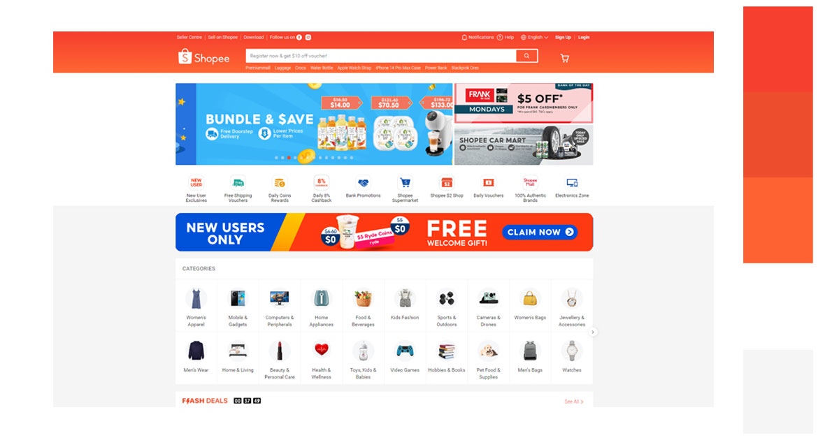
1. Analogous/Hue (the warm colors)
Red-Orange-Yellow
When you think of warm colors, you’d conjure up images of the sun, heat, and fire. They are a great orange color combination because they share this feeling of passion and energy.
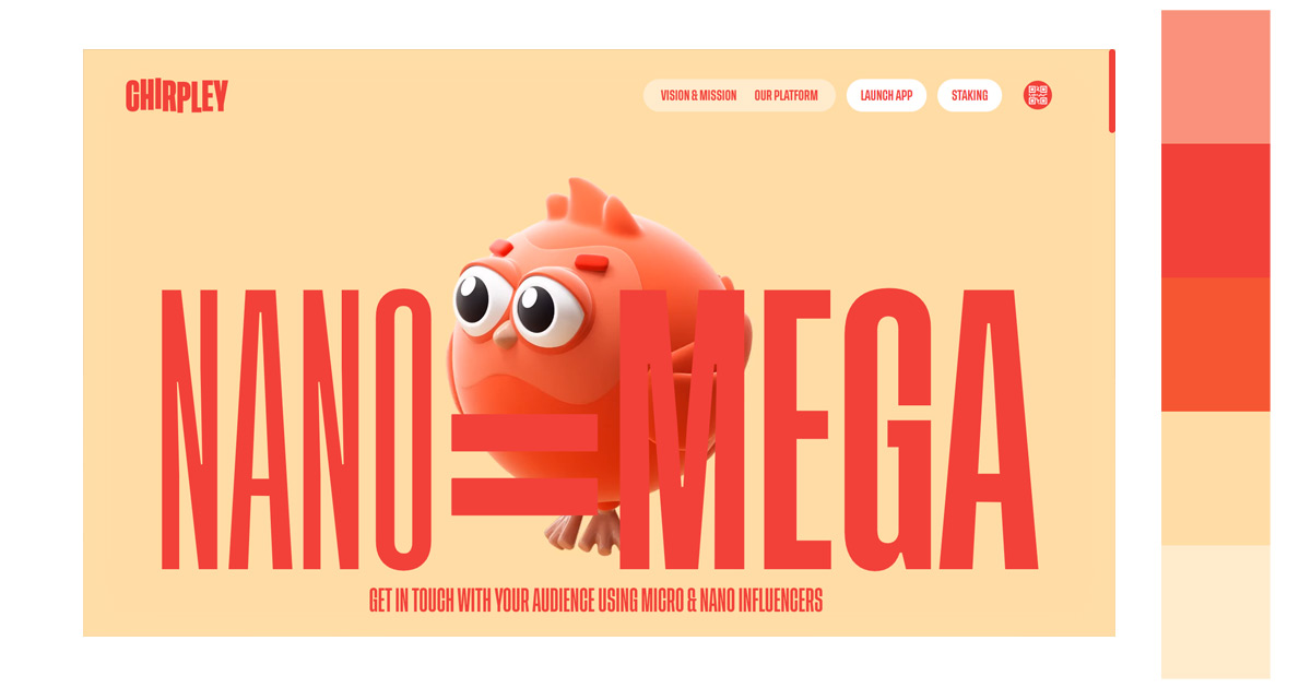
Red-Red Orange-Orange-Yellow Orange
Warm colors increase attention because of their vibrancy. Especially if combined with red, it tends to have a feeling of urgency and movement. It makes you move into action.
2. Monochromatic/Tint
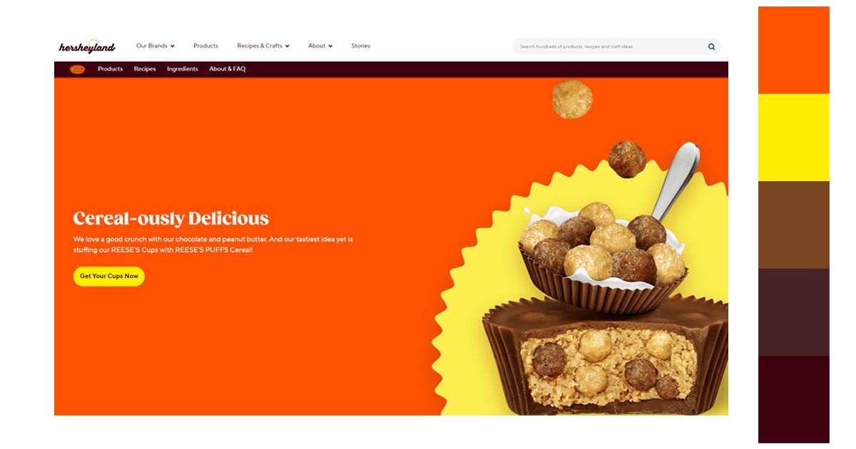
Flesh-Orange-Brown-Dark Brown
To create a visually cohesive look, use monochromatic colors with orange. Since orange can be a little overwhelming, combining it with darker earth tones will balance out the image. This will help your content to shine more.
3. Complementary (the opposite of the warm colors)
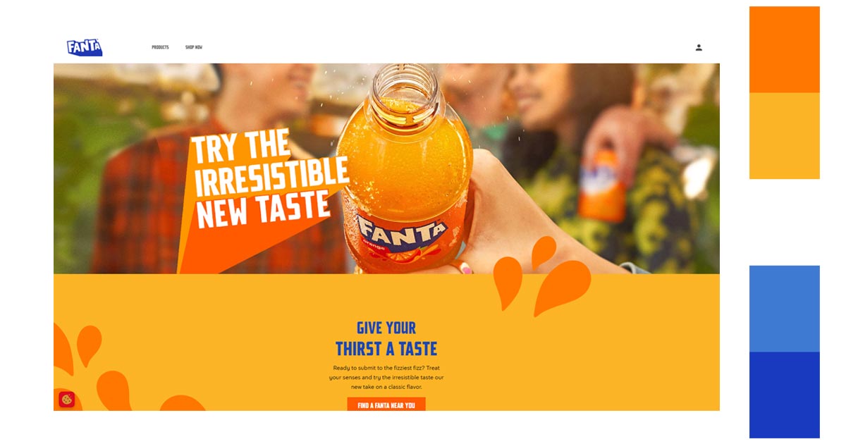
Orange-Blue
Complementary colors are colors that are opposite of each other on the traditional color wheel. In this case, blue is the primary color and orange is the complementary color. Using this combination creates the highest contrast which is very pleasing to the eyes.
4. Split Complementary
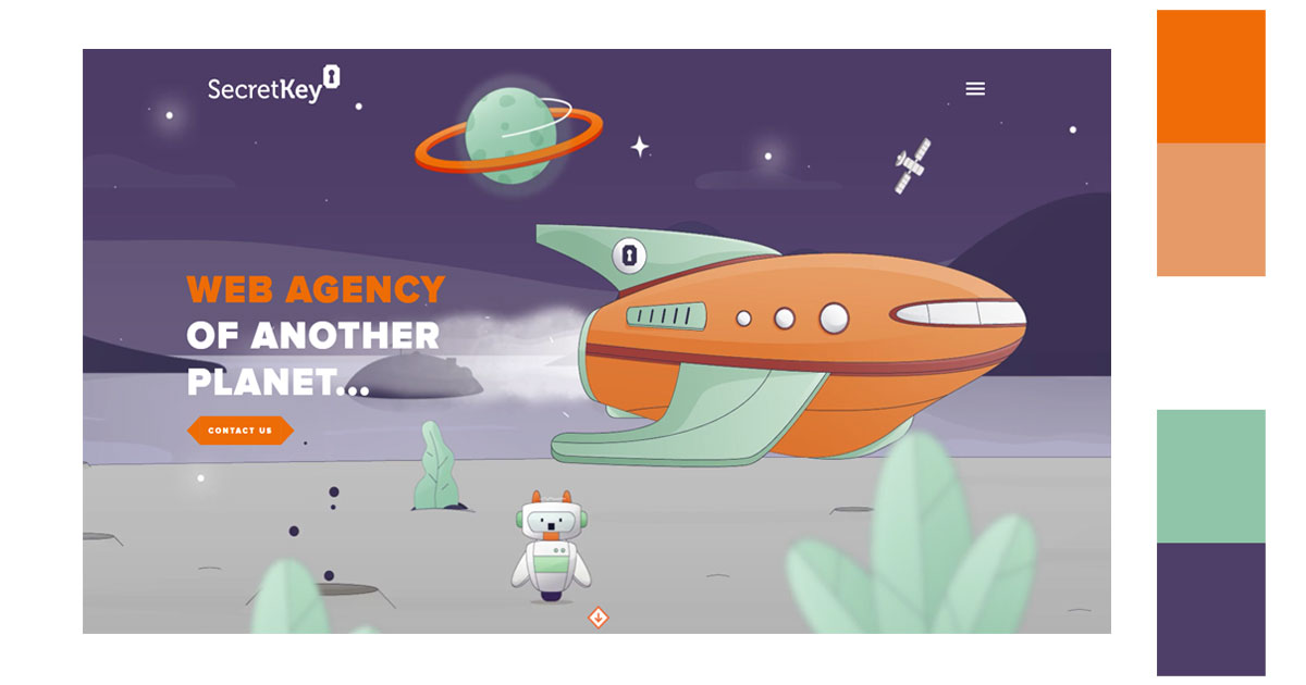
Orange-Blue Green-Blue Violet
Split complementary combination uses three colors instead of just two. You’ll need a color wheel for this. Start with your base color, in our case, it is orange and then combine it with the two colors that are directly adjacent to its complementary color without choosing the complementary color itself. Use these colors only to highlight certain elements in your design because if you are not careful your image could appear chaotic due to the colors.

5. Triadic/Secondary Colors
Orange-Green-Violet
A balanced triadic color focuses on the dominant color (orange). The other two evenly spaced colors(green and violet) are used as accents. This will make your image vibrant and colorful with a touch of playfulness.
6. Tetradic
Red-Orange-Green-Blue
In this color scheme we will be using four colors. On the color wheel, it is the brightest of all the color schemes because it has 2 complementary color pairs. You can use this for style and appeal purposes.
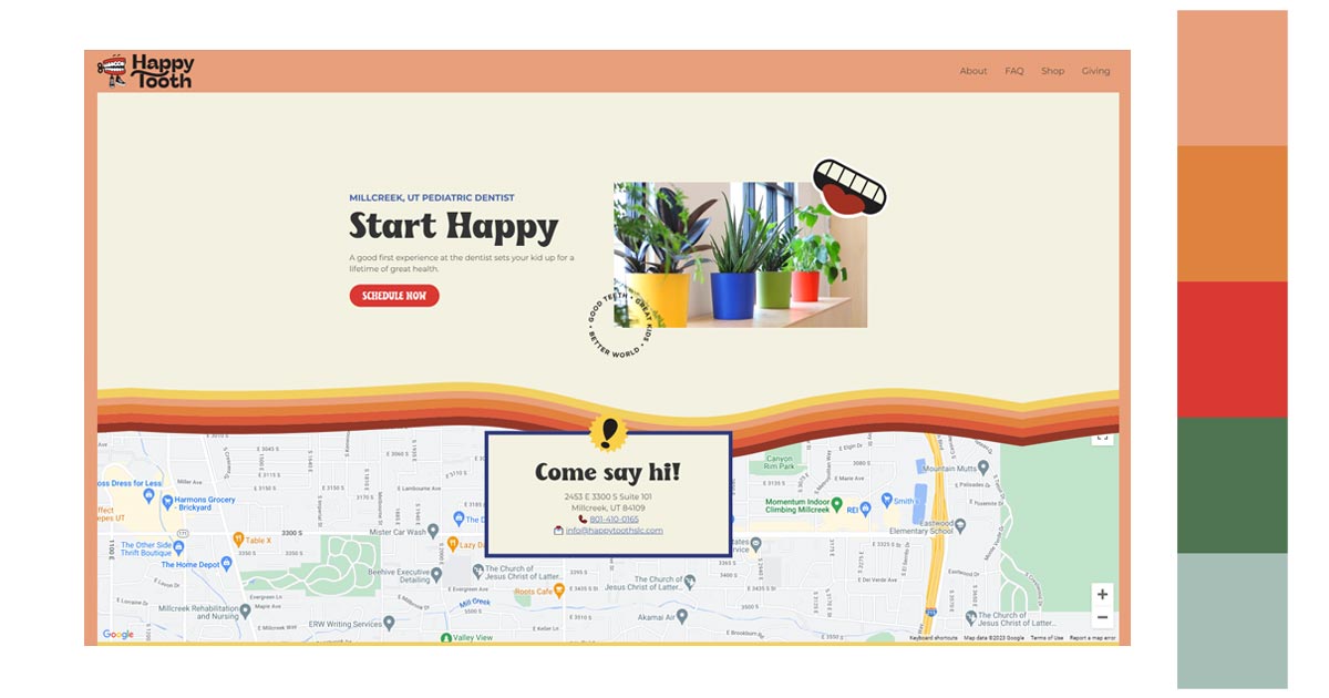
Orange-Yellow-Blue-Violet
Using tetradic colors also creates a feeling of optimism, openness, and diversity. It evokes a very vibrant and uplifting look for your image.
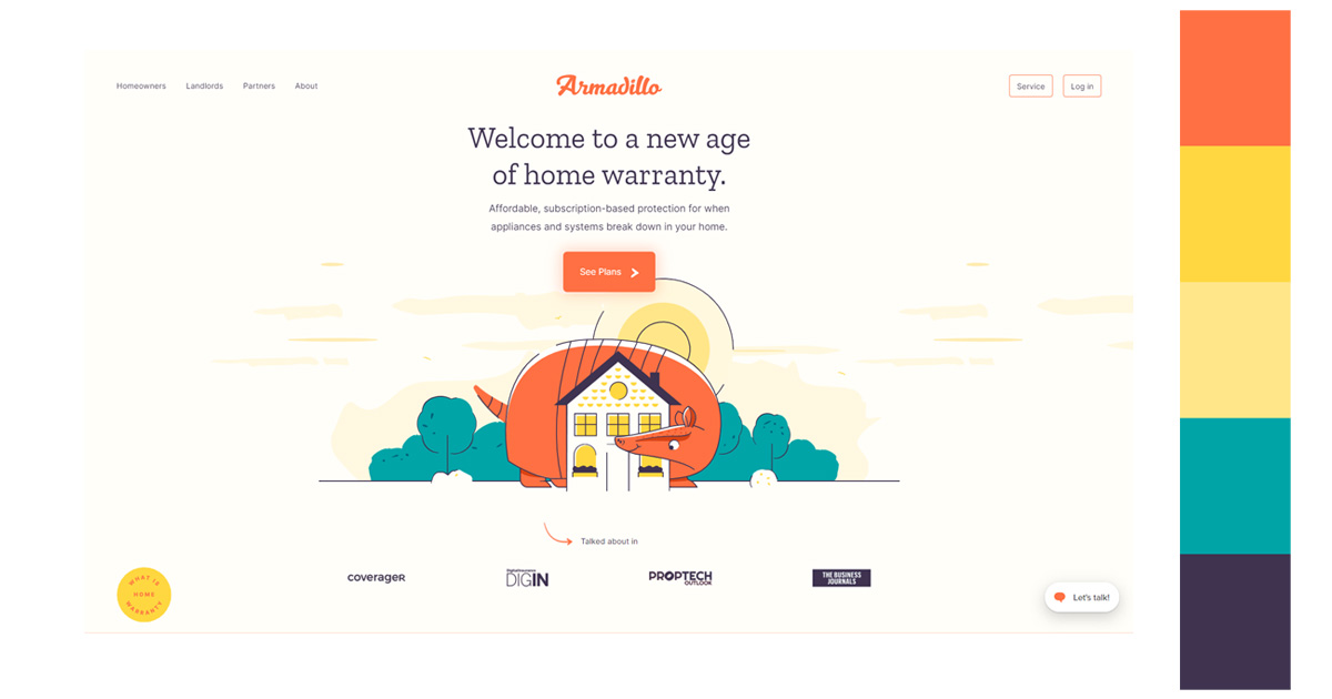
How Can You Use These Orange Color Combinations?
The orange color is attention-grabbing. It’s vibrant, fun and a very energetic color. Once you have perfected the use of various orange color combinations, it’s time to apply them to your projects.
1. ECommerce

In Ecommerce, visual content is very important in marketing. It can have an effect when it comes to sales and user engagement. Color has an 85% influence on shoppers’ purchase decisions. Since it is the first thing that attracts their attention.
Amazon logo colors used to be just black and white. The iconic Amazon smile was changed to orange to be more appealing. They added various shades of bright color to appear more friendly. Add in the darker shades of blue to add a sense of reliability. You end up with a perfect combination of a dependable and favorable brand.
2. Website Design
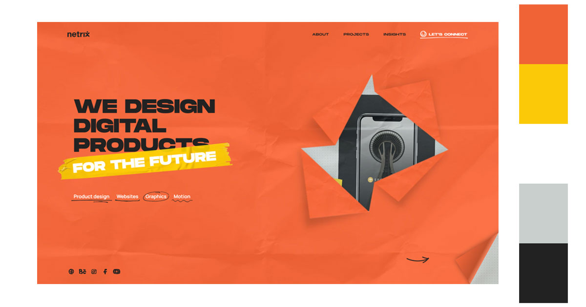
In a website, the quality of the content is key. But the design of your website can also be just as important. You should know that 95% of people will leave a badly designed website. You have to make the best first impression. Around 50% of internet users say their opinion on brands depends on their web design.
Use orange as an attention-grabber. Its lively and energetic color will be eye-catching. Play on its color. Add further elements that will add to your content. Use other colors as accents, especially dark neutral ones.
3. Interior Design
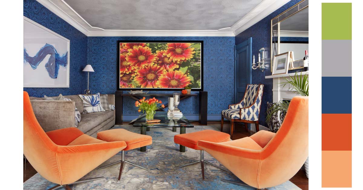
In interior design, it is a common practice to use neutral colors in most of the spaces and then add a pop of color as an accent. Best color combination for orange natural hues like browns and greens. Grey is also a good orange color combination. Orange brings warmth to the cold and pale shade of gray.
Decorating with orange can add a contemporary spin to your interior or add a cozy vibe to your space. You can even use the color all year round. It could add warmth in the winter months or vibrancy during summer. It could be a versatile color since various shades find it is complementary,
4. Graphic Design
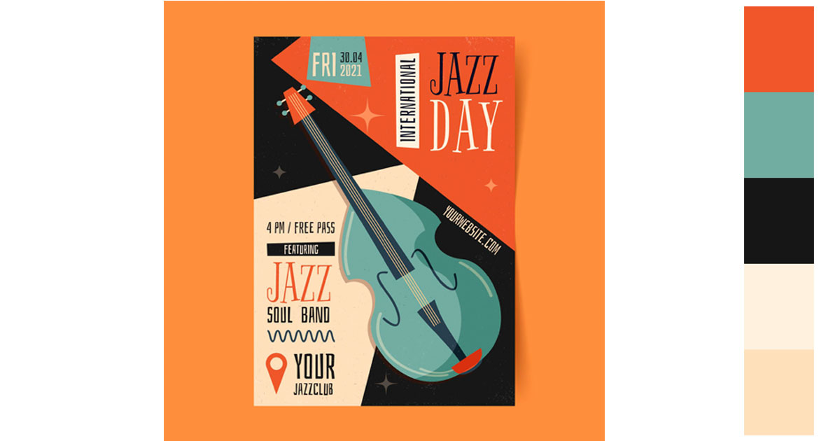
As a designer, color is often used to create a message. People are naturally attracted to vibrant colors. But, people’s attention span is very limited. In this regard, you have to be able to convey your message in mere seconds. Color helps in this matter. Using vibrant colors signifies a celebration. The color orange depicts a day of happiness, excitement and fun. Using the green color is one of the best orange color combination.
5. Photography
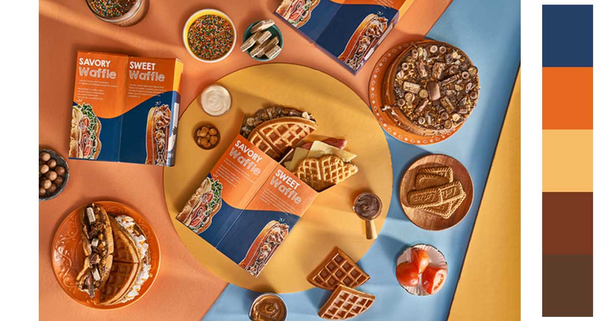
In photography, orange represents desire, passion, and love. It is considered a dominant color as well as red and yellow. They demand your attention and draw your interest. Another combination color for orange is blue which is a receding color. Visual depth is achieved if you use orange as the dominant color and blue as a background.
You can use Removal.AI to help you isolate your image from the background. You can then use various background colors and color schemes as your background.

Use the Color Orange for Your Next Designs
Color is a very important aspect of our everyday life. It helps us communicate our ideas and emotions. It gives meaning to certain concepts and designs that make them more significant and powerful.
Do not be afraid to use color in your designs or in your projects. It could be a little bit overwhelming if you think about it. There are almost an infinite number of colors. How would you know which ones to use?
Try to remember, color communicates on an emotional level. We feel colors. We give meaning to colors. It would not be a bad decision to factor in how you feel when it comes to deciding which colors to use.
Orange could be a color you could start with. It is always nice to start your design with a dash of enthusiasm and joy. It also represents creativity and optimism. And, these two are the two things designers and creators need to carry throughout every project.
