Design Inspiration: What Colors Go Best With Yellow?
The color yellow is one of the most vibrant and eye-catching colors in the spectrum. Whether you’re aiming for subtle elegance or vibrant excitement, yellow can be the cornerstone of your color scheme. It can be paired beautifully with other colors depending on the mood or look you want to convey to your audience.
Colors That Go Well With Yellow
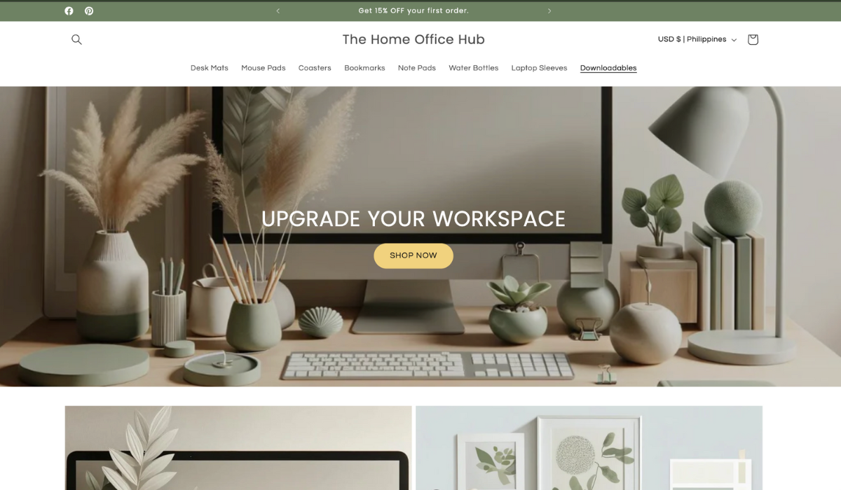
- Green (natural, serene, and rejuvenating): Green and yellow exist abundantly in nature. Using these colors together creates an organic, calming, and refreshing feeling.
- Gray (modern, sophisticated, and balanced): Gray tones down the brightness of yellow. This creates a stylish and professional feel in designs.
- White (fresh, clean, and uplifting): White enhances yellow’s cheerful vibe. Using both will result in a refreshing and airy atmosphere. This combination is ideal for minimalist designs.
- Black (bold, dramatic, and energetic): Pairing black and yellow creates a high contrast. This can command attention and strike an impact on any design. This pair is often used to create a strong, authoritative presence.
- Blue (refreshing, calm, and trustworthy): Blue and yellow are complementary colors that create a vibrant yet harmonious contrast. This combination evokes feelings of trust and dependability.
- Purple (luxurious, creative, and regal): Purple and yellow are often used to convey creativity, luxury, and a sense of royalty. This combination can also evoke feelings of optimism (from yellow) and introspection or spirituality (from purple). Therefore used to create an emotional and engaging atmosphere.
- Brown (earthy, warm, and stable): Brown and yellow together evoke a natural and earthy feel. This combination is warm, inviting, and can bring a sense of stability and reliability.
- Pink (playful, romantic, and energetic): Pink and yellow create a bright and cheerful palette. They are often used to convey playfulness and romance, adding energy and vibrancy to designs.
- Red (bold, passionate, and lively): Red and yellow are both strong colors that, when combined, create a dynamic and energetic feel. This combination is eye-catching and conveys passion and liveliness.
- Orange (vibrant, warm, and enthusiastic): Orange and yellow together create a warm and energetic palette. This combination is often associated with enthusiasm, warmth, and a sense of adventure.
- Turquoise (cool, fresh, and invigorating): Turquoise and yellow create a lively and fresh combination. This pairing is invigorating and can evoke feelings of tropical freshness and creativity.
Design Inspiration: Example of Palettes Using the Color Yellow
To find complementary colors for yellow, look at the colors adjacent to yellow on the color wheel. These color schemes combine a primary color, a secondary color, and a tertiary color.
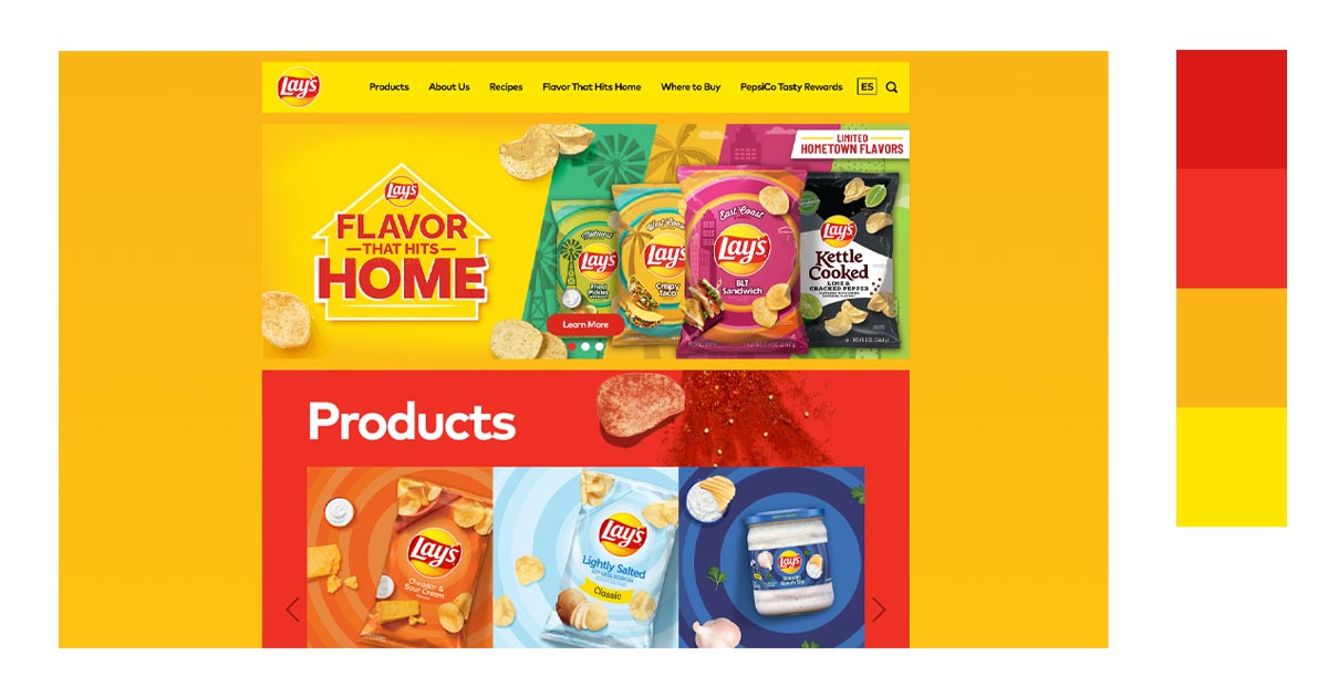
1. Yellow, Red, & Orange
When these colors are used together, they create a visual that is vibrant, warm, and full of energy. This color combination is perfect when you want to convey excitement, positivity, and creativity in your design,
Here’s an example of making use of the colors’ vibrancy. You can feel the energy coming from the design.
2. Yellow, Orange & Green
This color combination creates a fresh, energetic, and vibrant palette. It is perfect for designs that aim to convey life, positivity, and vitality.
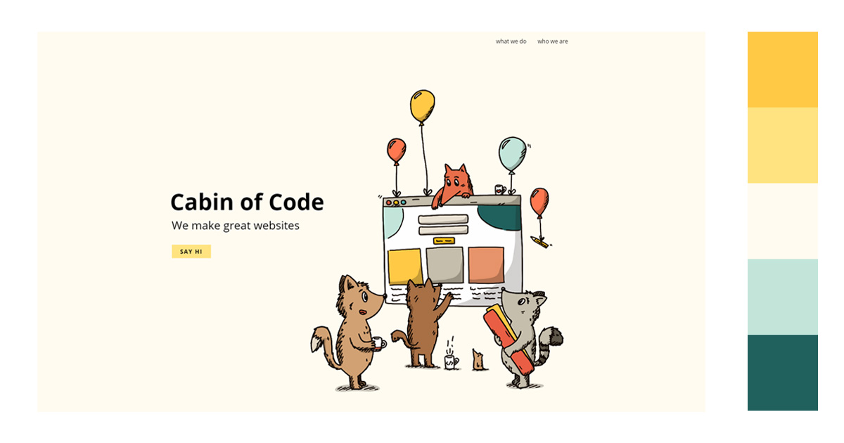
Using green and yellow together in design typically conveys a mood of energy, optimism, and natural harmony.
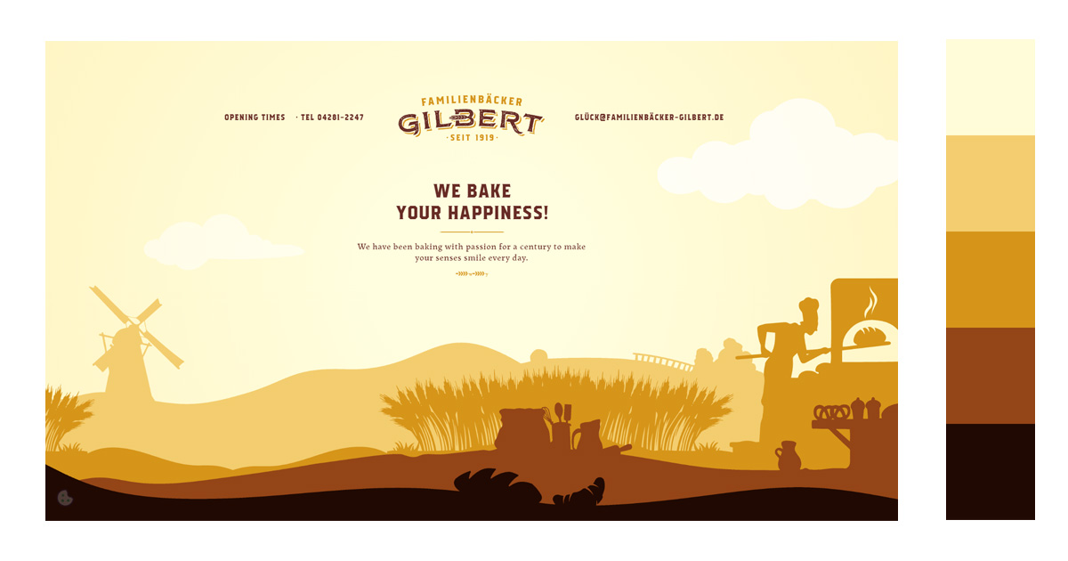
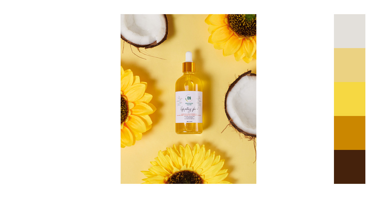
3. Yellow + Ivory, Goldenrod, Brown, and Dark Brown
This palette represents inviting, cozy, and grounded moods. The combination of bright and cheerful energy of yellow complements the warmth and sophistication of other earthy tones.
4. Yellow + Violet
Purple is best to combine with the color yellow if you want to make your images pop. Since they sit on the opposite sides of the color wheel, it creates a high contrast which results to a dynamic but intriguing color scheme. By using this color combination, you can evoke a range of emotions to your audience, from excitement and creativity to luxury and contemplation.
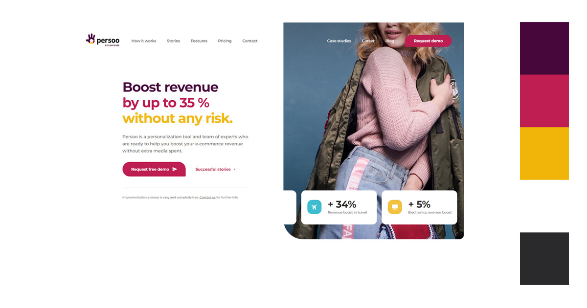
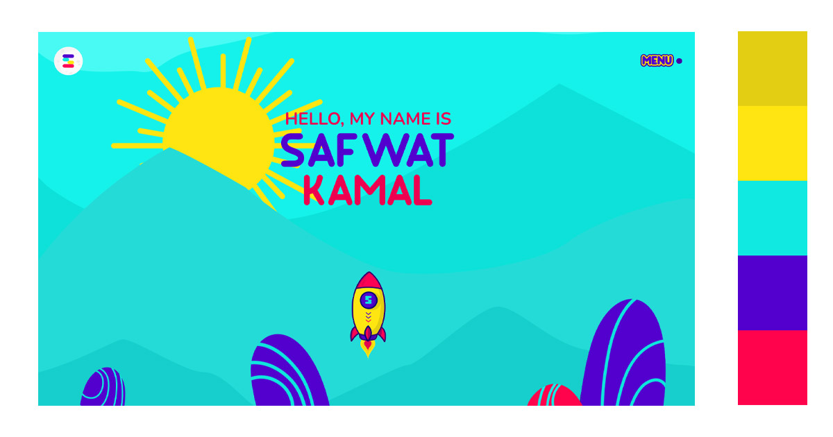
5. Yellow + Blue Violet & Red Violet
This palette is ideal for striking and memorable designs. It works well for branding, posters, and marketing materials where you want to convey creativity, passion, and sophistication.
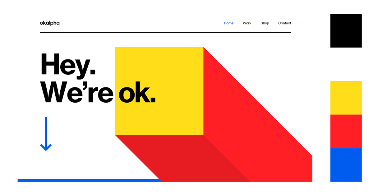
6. Yellow + Red & Blue
Use these colors in marketing campaigns to attract attention and convey a sense of enthusiasm and trust. They are perfect for brands in the technology, education, and sports sectors.
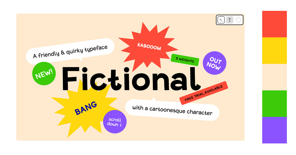
7. Yellow + Green, Red & Violet
When combined, yellow, green, red, and violet create a palette that is both vibrant and harmonious. The brightness of yellow and red is balanced by the calming green and the depth of violet. This combination can evoke a range of emotions, from excitement and creativity to tranquility and luxury.
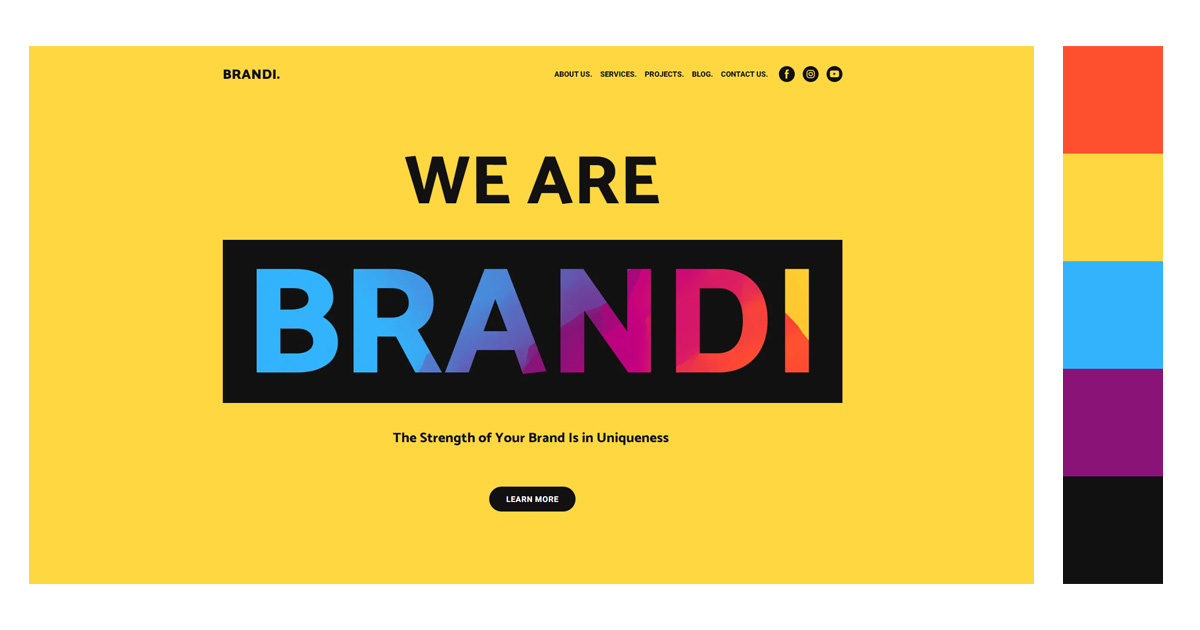
8. Yellow + Orange, Blue & Violet
This palette can grab attention and create a lively and engaging atmosphere. It’s a good choice for designs that want to stand out or energize the viewer. Despite the contrasting warm and cool tones, the presence of blue and violet helps to balance the intensity of yellow and orange, creating a sense of harmony.
Application: The Effective Uses of Yellow Color Combinations
Now that you have an idea on what colors go best with yellow, here are some examples on how to apply them in your work.
1. Website Design
Since the yellow color is associated with warmth, sunshine, and happiness, it can trigger the release of a feel-good hormone called serotonin. This can also stimulate appetite thus, making it an effective branding color for businesses that offer food products. Additionally, it creates a welcoming vibe for your site visitors that may influence better interaction with your site.
But, since it is a powerful color, it could be too much for some people. Balance the warm colors with cool colors like green and blue. Your typography must be bold and block for easy reading.
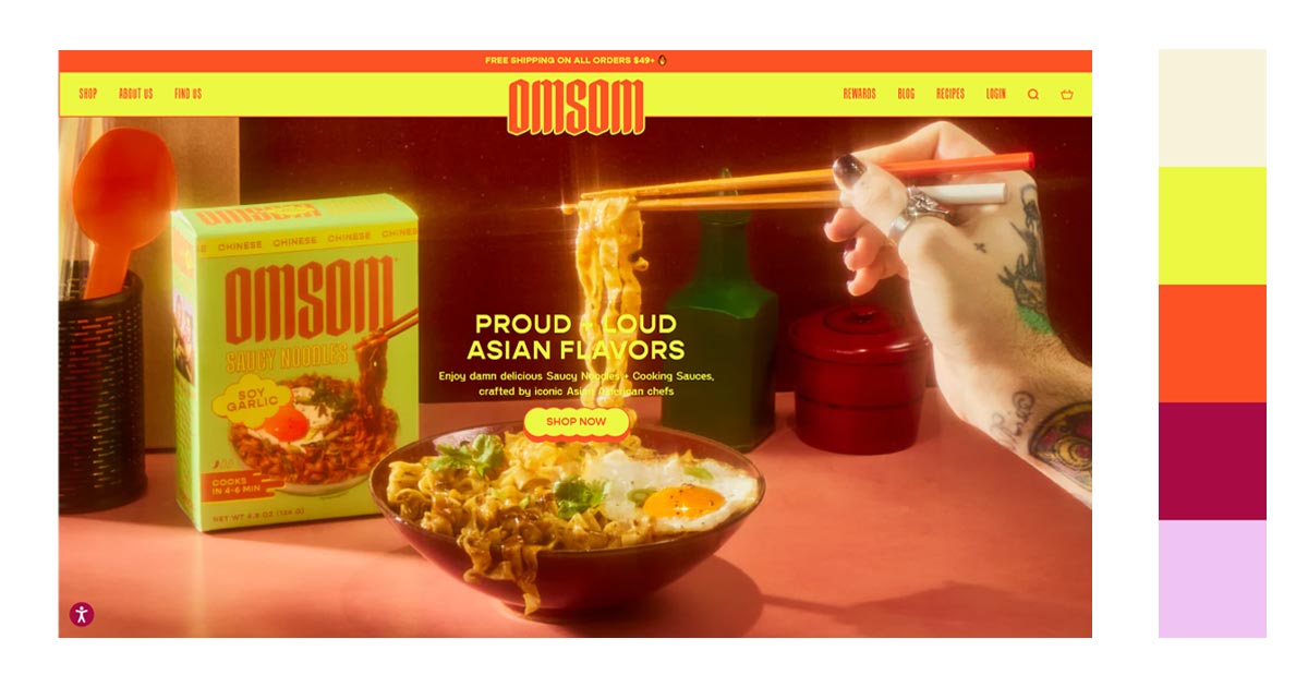

The color yellow also invites feelings of optimism and playfulness. It can give a sense of warmth and engage your audience. With its vibrancy, it creates a lasting impression on your audience. It makes you and your site memorable.
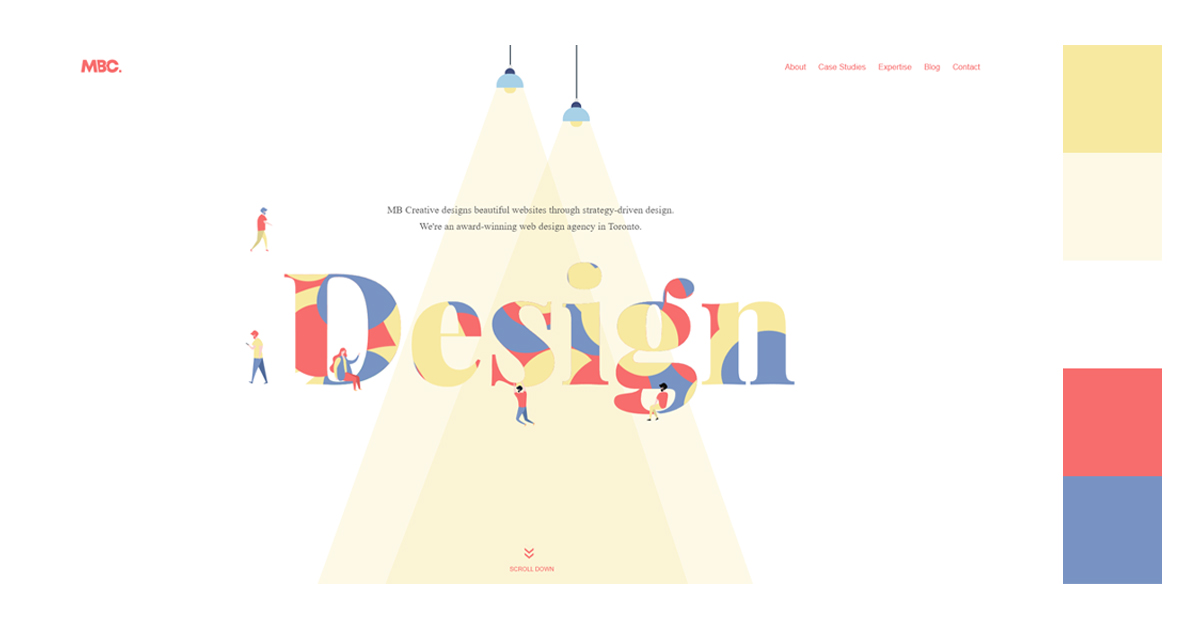
Choosing what colors go best with yellow is made simpler by having cool colors like blue and warm colors like red together. Warm and cool balances out the image to keep it from being overwhelming.
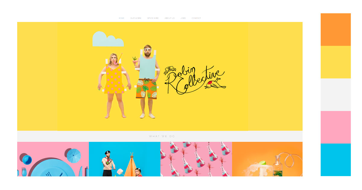
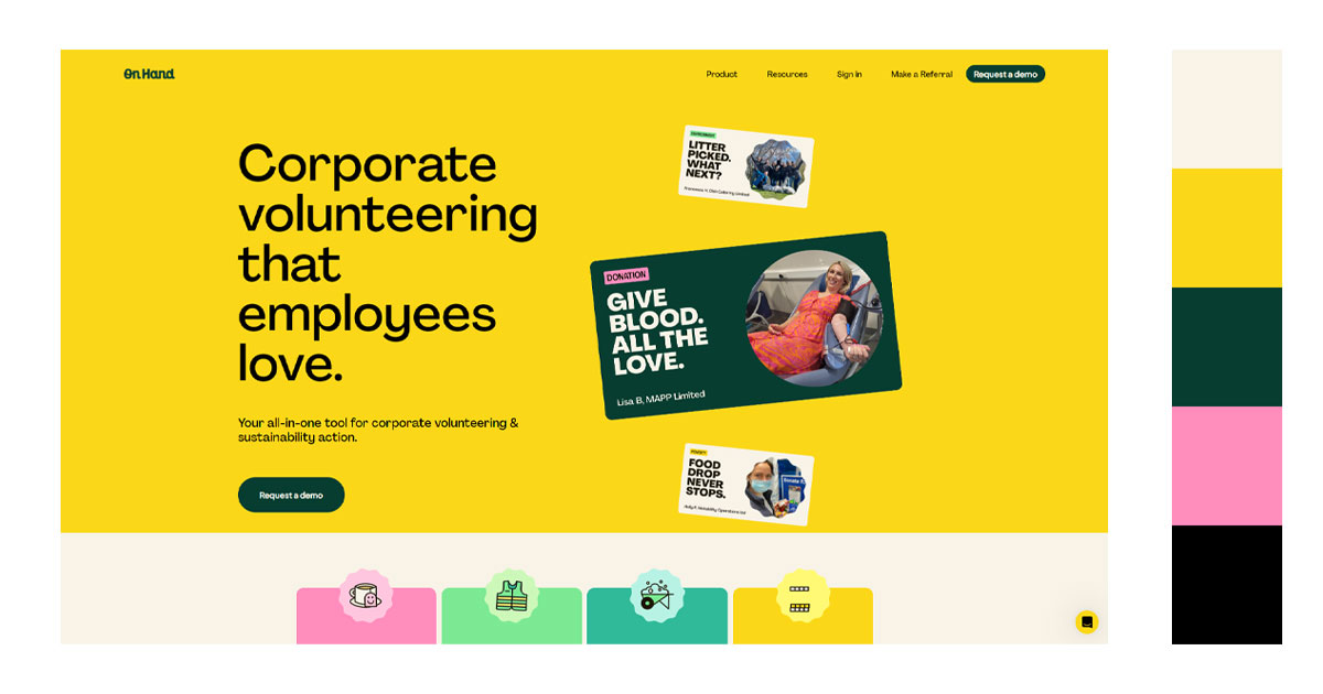
Using yellow as your background will make your other elements, like images and pictures, pop. A collage of pictures with a yellow background is quite engaging. Also, the background enhances your typography which makes it easier to read and understand.
Try to remove bg from your images and create collages for your website banners:
Just make sure that the color of your elements contrasts with that of your background.
3. Interior Design
Yellow is a happy color. It can brighten spaces by adding energy and light to the room. Choose which shade you’ll be using since the color can be overwhelming if used recklessly. Also, take note to make allowances for different lighting situations.
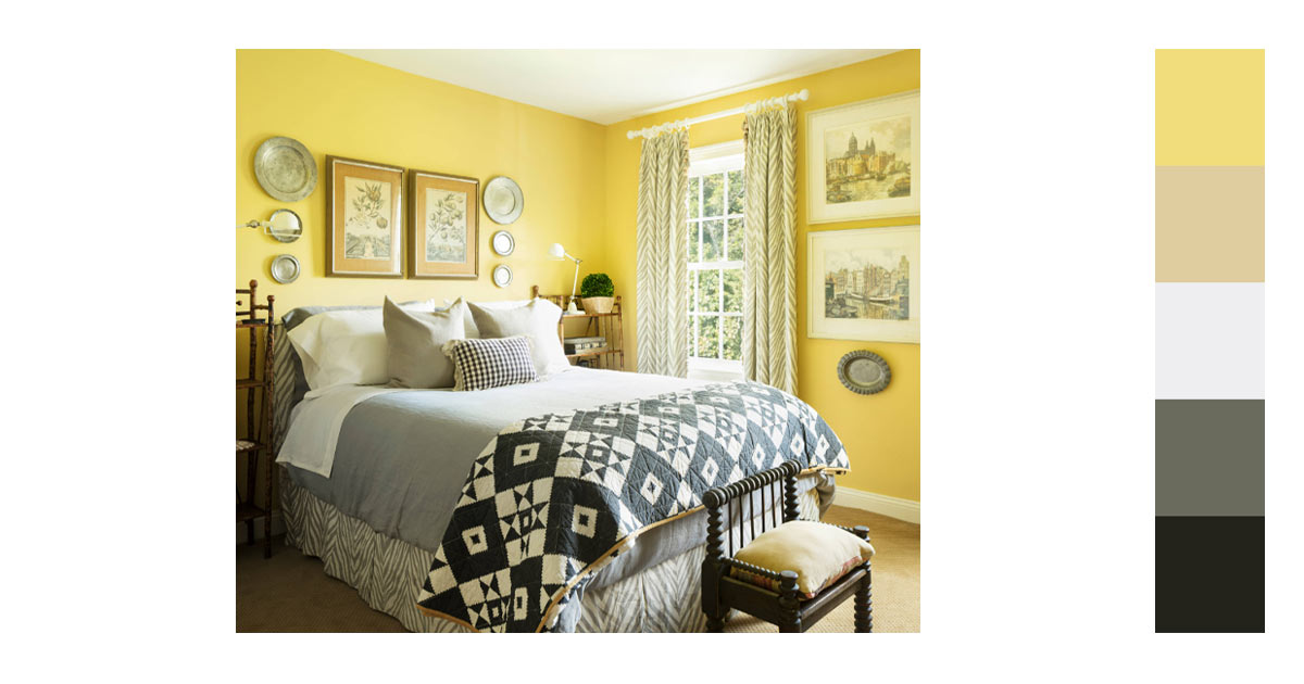
A bright and sunny room will appear even brighter if there is access to ample natural light.
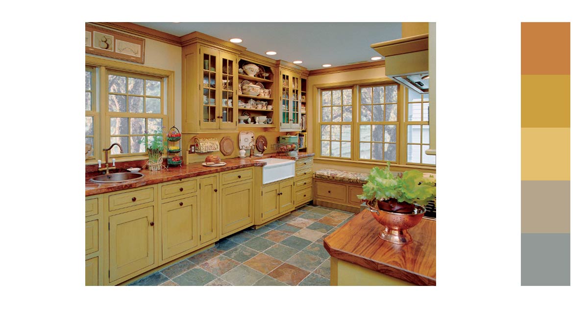
Yellow with brown or wood is also a great choice to create a warm and cozy feel to the room. This is then complemented by the various shades of brown and yellow on the kitchen floor tiles.
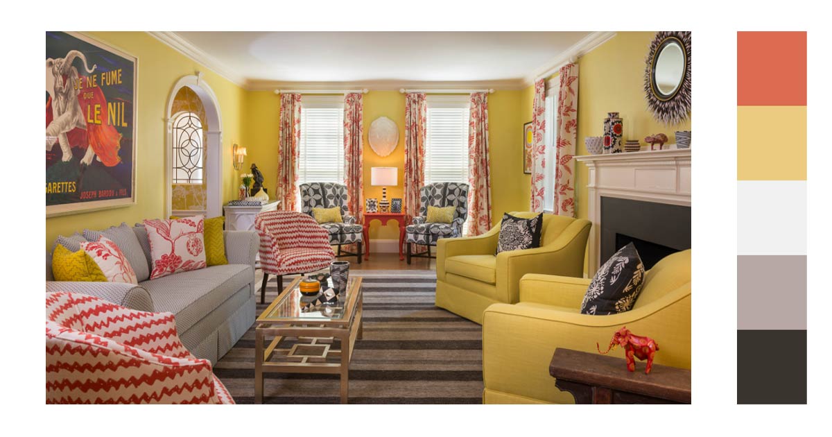
Brighter yellow shades are better paired with pink and orange. White, red, and brown also complement this arrangement.
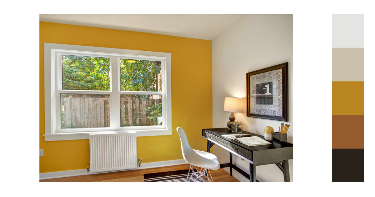
An accent wall of a darker shade of yellow can add drama to an otherwise plain white room. Add in darker furniture anchors down the room.
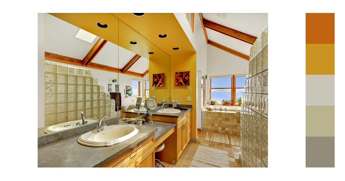
A darker shade of yellow which is closer to being orange could darken a small room. This can be solved by making sure that there is ample natural lighting.
4. Graphic Design
Yellow in graphic design creates a warm welcoming environment.
The color can be used to highlight important elements. It conveys a feeling of urgency and of motion. So, it is a powerful color to use to provoke positive emotions.
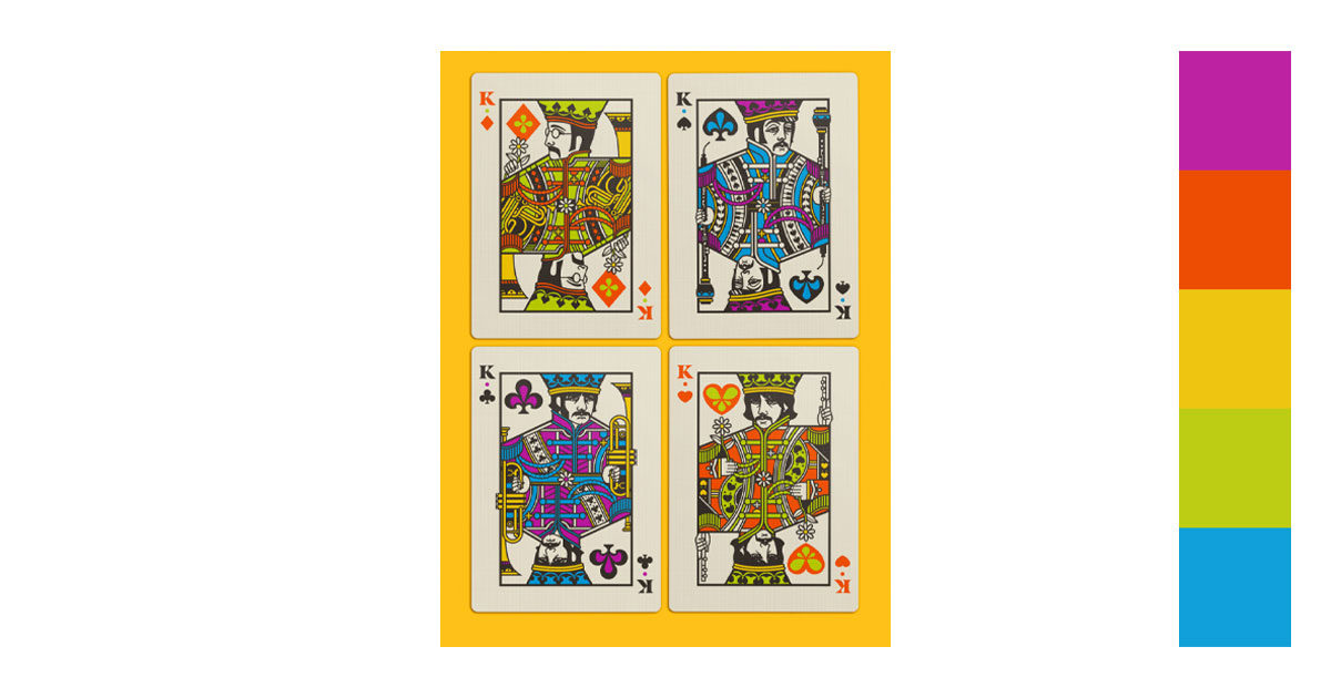
The design is very attractive with its use of complementary colors. Even though it uses a lot of colors the yellow background works well in grounding them.
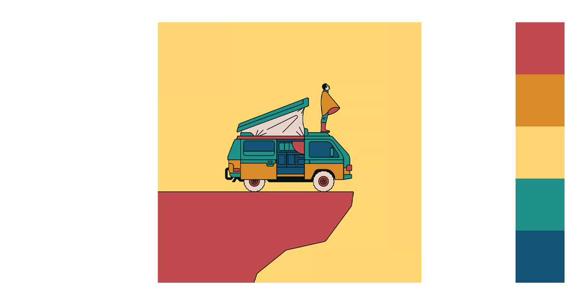
Warm and cool colors always look good together.
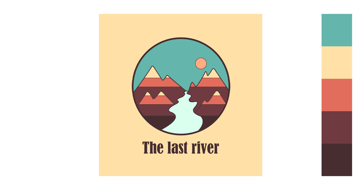
Yellow must not always be yellow. You can use different shades and hues of yellow in your design. Don’t be limited with your color choices.
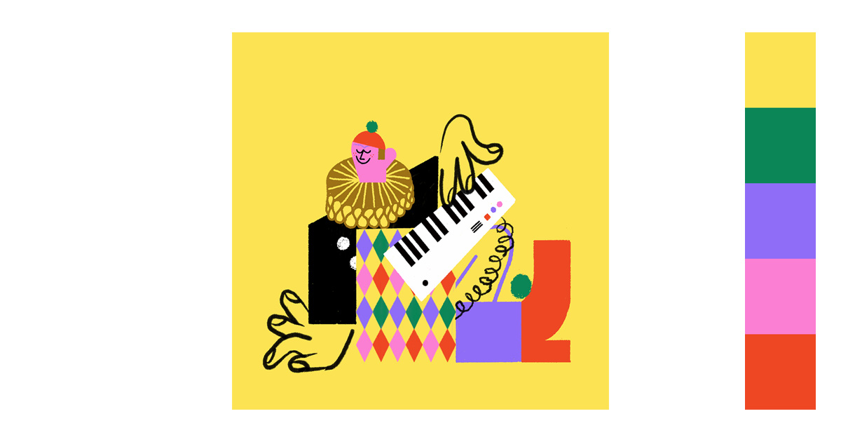
Yellow will always get your attention. It is vivid and eye-catching. The other colors are equally bright which makes the image evoke feelings of playfulness and happiness.
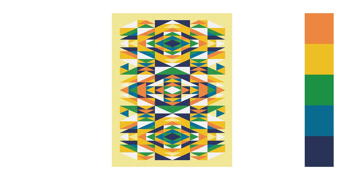
It is always good to keep it in the family. Since orange is a very dark shade of yellow, the combination is not really a leap in logic. The green and blues give a nice contrast to the color siblings.
5. Photography, Branding, & Packaging
If yellow is mentioned in photography, more often than not it is referred to as the golden hour. This is the time of day just after sunrise and just before sunset where you can find a distinct yellow hue in the daylight. You might call it a natural filter for dynamic photography.
For product images though, it creates a bright background that enhances your subject. Careful lighting creates shadows for added effect.
The yellow color along with other colors enhances versatility in packaging design. For example, combining yellow with black creates a high-contrast look that’s both striking and legible, while yellow and green can evoke natural and eco-friendly connotations. So if you want to impress these emotions with your customers, create custom packaging designs and boxes with this color and bring them the best unboxing experience.
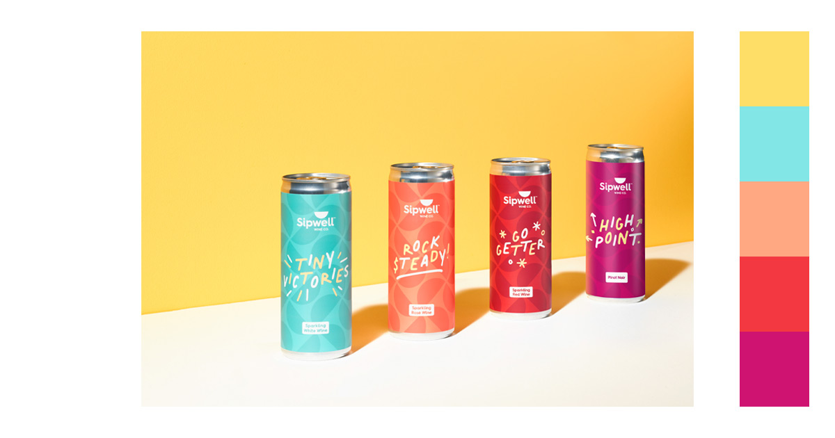
Red and purple are colors that go well with yellow. They create very eye-catching contrasts.
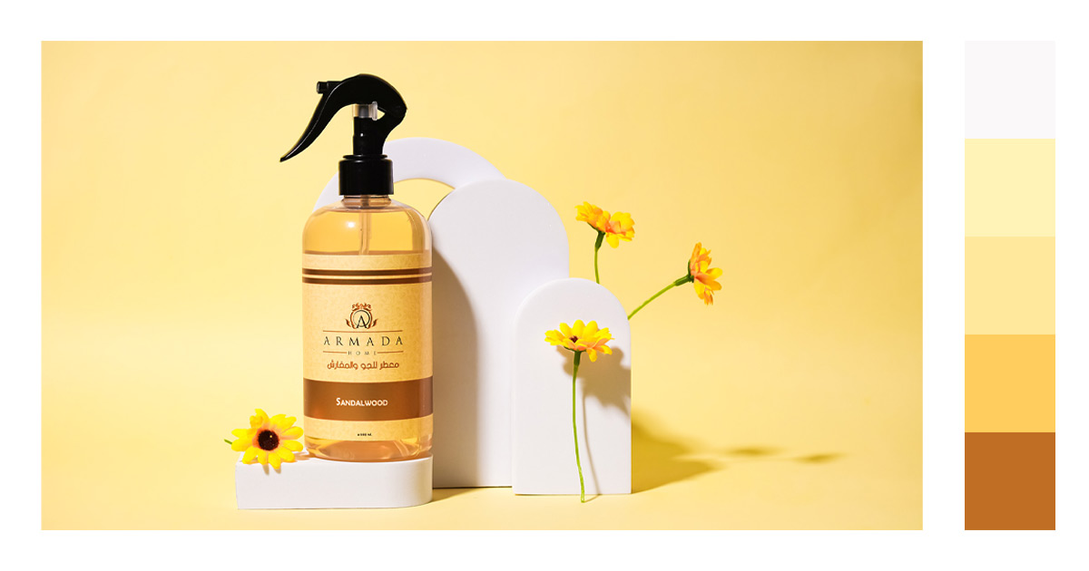
Different shades and hues of yellow are used in this picture. The white cardboard helps the product not to merge in with the background
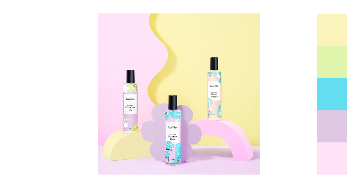
Yellow and purple are always complementary to each other so there is visual harmony
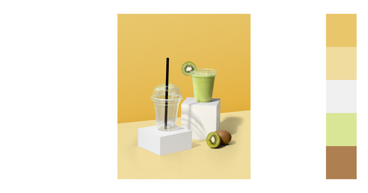
Earth tones and greens are also a favored combination. There is harmony with subtle variations in the shades to bring about contrast.
With the technology that we have today, color matching and color combinations are easier to do than ever before. All you need is a little patience and a penchant for colors to do a good job.
Summary of the Psychology of the Color Yellow
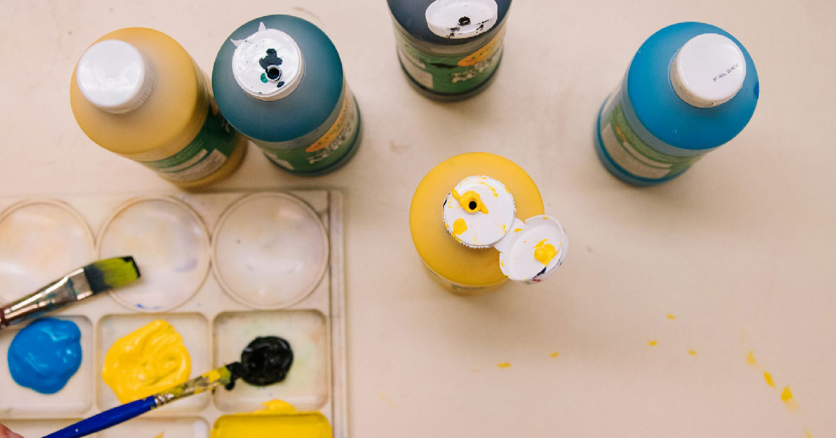
Our understanding of the color must not be limited to what color goes best with yellow or what color combinations with yellow are best. A clear understanding of what reactions the color can cause our audience is also important.
Color psychology explains that certain colors affect our behavior and emotions. This can affect our decision-making and even impact our moods. Added to this is that culture and personal preferences can also influence our perception of certain colors.
Emotional and Psychological Response
The smiley emoji is the embodiment of the color yellow. It is laughter, sunshine, and happiness. People often feel invigorated and cheerful when they see the color.
The color yellow helps the brain release a chemical called serotonin. Serotonin acts as a mood stabilizer which is also referred to as a happy chemical.
It is a motivating color since it is associated with sunlight. There is enthusiasm and creativity in your work.
Negative Effects
Yellow is not all sunshine and happiness. Sometimes it can be a negative emotion.
Negative feelings like betrayal, anxiety, illness, cowardice and egotism can be conveyed. And, since it is an intense color, it could be a little too aggressive and confrontational. In great quantities, it can sometimes cause people to become irritated.
Yellow is also associated with caution. So, a feeling of danger or anxiety can be felt.
This is the reason why you need to have an understanding of the best color combinations with yellow to balance out these negative effects.
Perception and Cognitive Function
The color helps in concentration. It wakes up your brain and increases the left brain which is responsible for analytical and rational thinking.
This is the reason why most traffic signs and road symbols are often depicted in yellow. It is imperative that the driver of the moving vehicle can see and immediately understand the traffic signs.
Your Turn
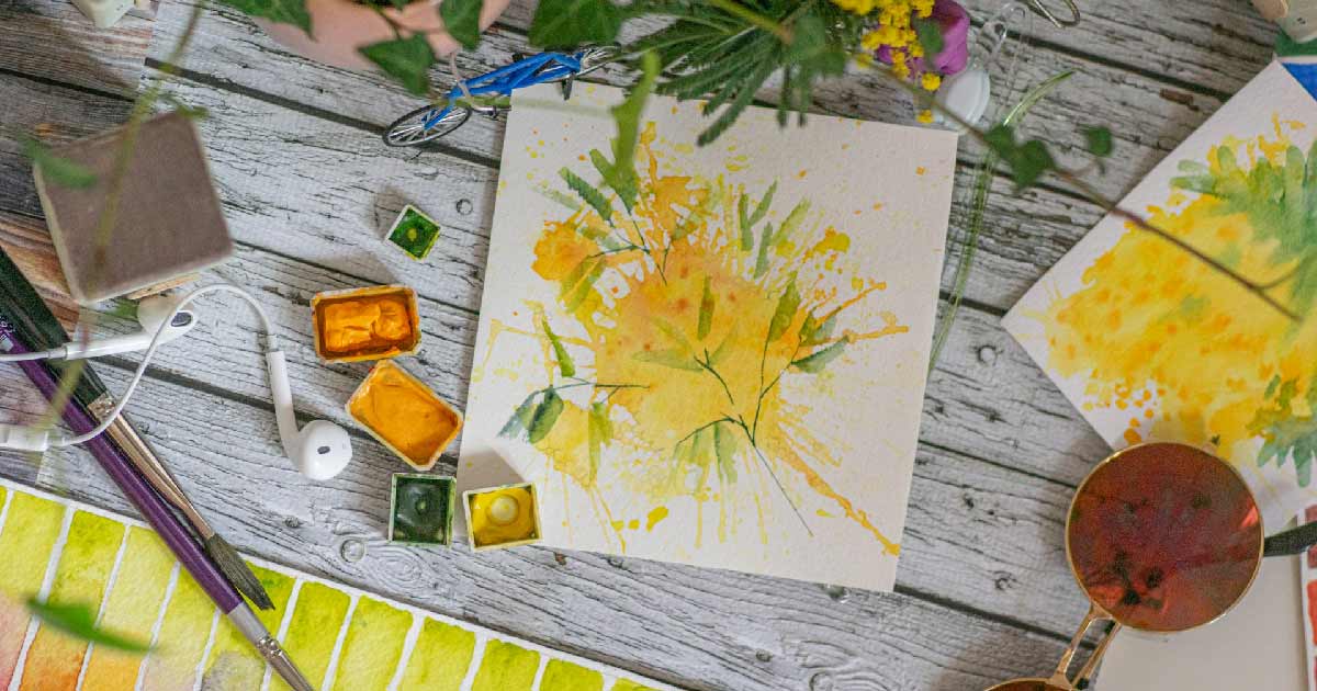
As a designer, you should not be limited by what colors go best with yellow. Take the time to go out beyond your comfort zone and try colors that you haven’t used before. You’ll be surprised at what you may come up with.
Yellow is a fun color. Its sense of enthusiasm is amazing. It may have started to be not the best but the color is now associated with positivity and optimism. Use it to your advantage.
Though the color is enjoying a revival of sorts, it may change as the years go by. As is with all others, perception does change with time. And, time is a cruel mistress.
But, the color is having its moment right now, let’s enjoy it.
